Prototypes
Exploring Visualization Onboarding Approaches

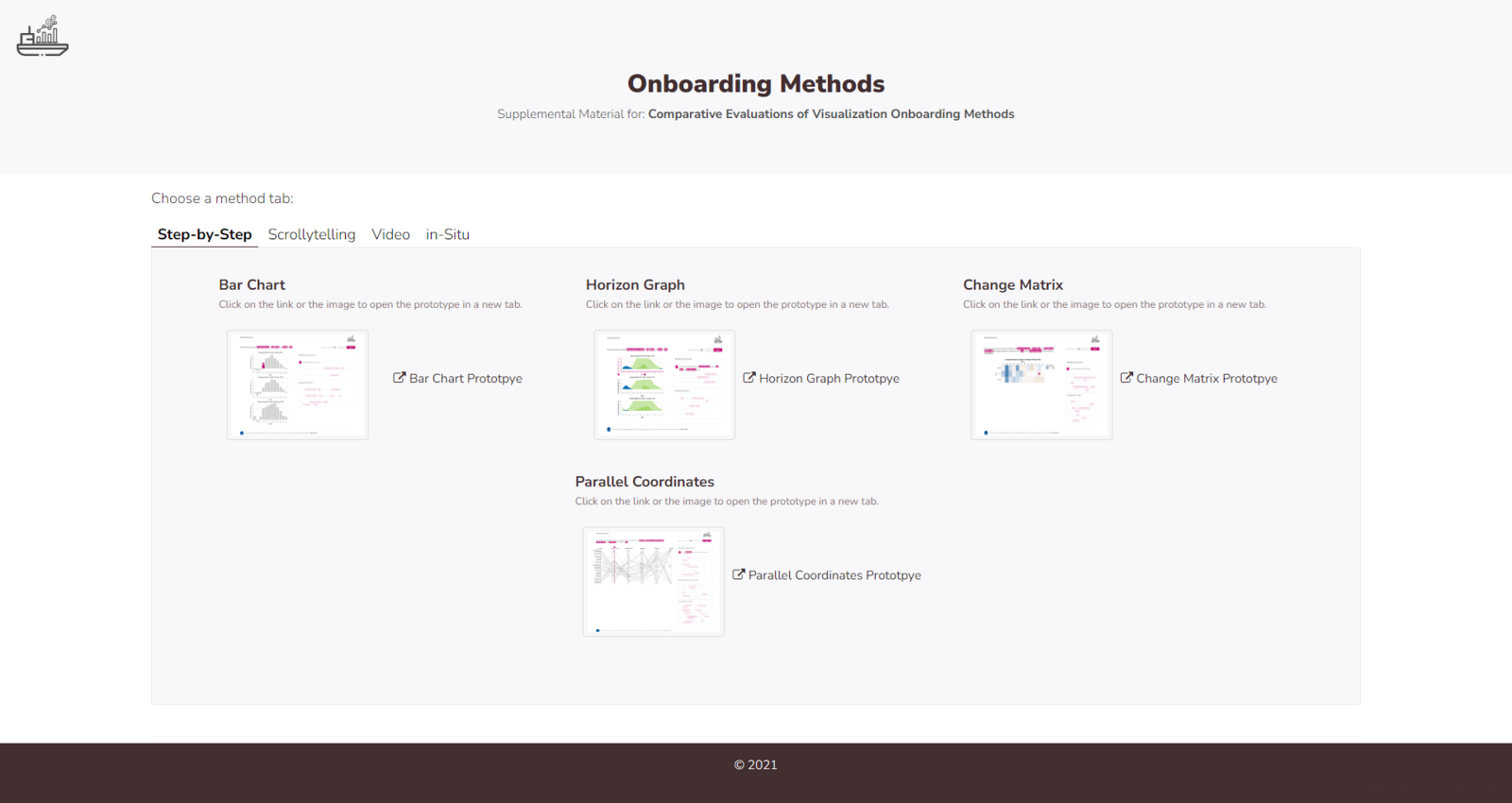
We designed four onboarding concepts and developed proof-of-concept prototypes based on the design considerations. We conducted two quantitative comparative user studies with MTurk workers and a qualitative comparative usability study with students. The main aim of these studies was to investigate the effect of onboarding on user performance and evaluate the subjective user experience. Furthermore, we explored abstract and concrete onboarding instructions and assessed them in a quantitative comparative user study with students.
The resulting prototypes can be accessed here: https://onboarding-methods.netlify.app/
Publications:
(1) Comparative evaluations of visualization onboarding methods:
https://doi.org/10.1016/j.visinf.2022.07.001
(2) Abstract and Concrete Materials: What to Use for Visualization Onboarding:
VisAhoi Library

We aim to integrate the visualization onboarding concept into VA tools using the underlying data of the visualizations. Available products for user onboarding mainly focus on the overall user interface rather than visual representations, as demonstrated by sources such as AppCues and Intercom. However, most user onboarding JavaScript libraries such as Hopscotch, aSimpleTour, Intro.js, webTour.js, Tourguide.js, Orient, GuideChimp, tutoBox are not fully suitable for visualization onboarding. This is because they are limited to guided tours that explain elements in the user interface, which can block the whole interface and prevent users from interacting with the visualization while seeking help. This is especially problematic when exploring visualizations because users should be able to interact with both the visualization and the onboarding simultaneously. Additionally, the existing onboarding libraries and solutions do not utilize the underlying data of the visualization, which is a critical factor in introducing unfamiliar visualizations to users.
Hence, there is a need for a JavaScript library to integrate visualization onboarding into VA tools that utilize the visualization's underlying data to explain the visualization and not block the whole interface while using the onboarding instructions. Therefore, we implement a JavaScript library called VisAhoi. The library covers the visualization onboarding design presented in this chapter. The in-place annotations allow users to see onboarding instructions based on the underlying data of the visualization. The onboarding message introduces specific visualization parts, e.g., axis, visual mapping, and legends, which are directly integrated into the interface, reducing the need to switch back and forth between the visualization and a separate tutorial or help section. The floating action button gives users a persistent and accessible way to access instructions throughout their interaction with the visualization.
Developing onboarding messages is a vital step in the design of visualization onboarding. Using a semi-automatic approach, the VisAhoi library leverages existing data and metadata about the visualization to generate onboarding messages and support developers and visualization designers with a blueprint that can be further customized.
Flourish Template

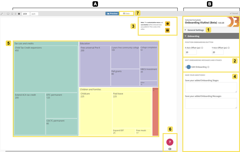
The proof-of-concept implementation of a self-explanatory visualization onboarding approach for data-journalistic use cases. The interface is divided into two areas: (A) preview with the visualization (5), the onboarding button (6), and the settings panel, and (B) Flourish (1) with the settings regarding onboarding customizations (2, 3, 4). Also, journalists can change the data of the treemap (7) provided by the Flourish template.
The authoring tool combines a Flourish template and the VisAhoi library. It provides a user interface to add onboarding and customize it: (1) editing, reordering, and/or removing the semi-automatically generated onboarding messages and onboarding stages, and (2) adding own messages and stages.
In general, the templates are divided into a fully customizable visualization area and the settings panel, which has limited customization possibilities. The Flourish template is open-source and can be accessed with a Flourish account at http://bit.ly/3gBqrxv.
We provide the code for the authoring tool in the GitHub repository at https://github.com/doomsayer2/Onboarding_DDJ_UseCase.
Data Analytics Onboarding
.png)
Automated dataset analysis using the Python library pandas_profiling delivering extensive insight, often overwhelming for DA novices.
We developed an interactive Data-Analytics-Onboarding-Notebook (dAn-oNo) --- a learning environment for journalists to understand data analytics methods. The notebook is based on a Jupyter notebook with mark-down sections explaining the data analytics pipeline. The main goal was to guide the user step-by-step through the data analytics process of a dataset by (1) removing the hurdle of coding, (2) enabling the user to understand the code and experiment with it, (3) helping novice users to understand the challenges and pitfalls of data analytics, (4) allow intermediate users to increase their skill level, and (5) keep the approach flexible and accessible.
Find the prototype source at https://github.com/stemrich/SEVA_DA-Onboarding-Tool
